
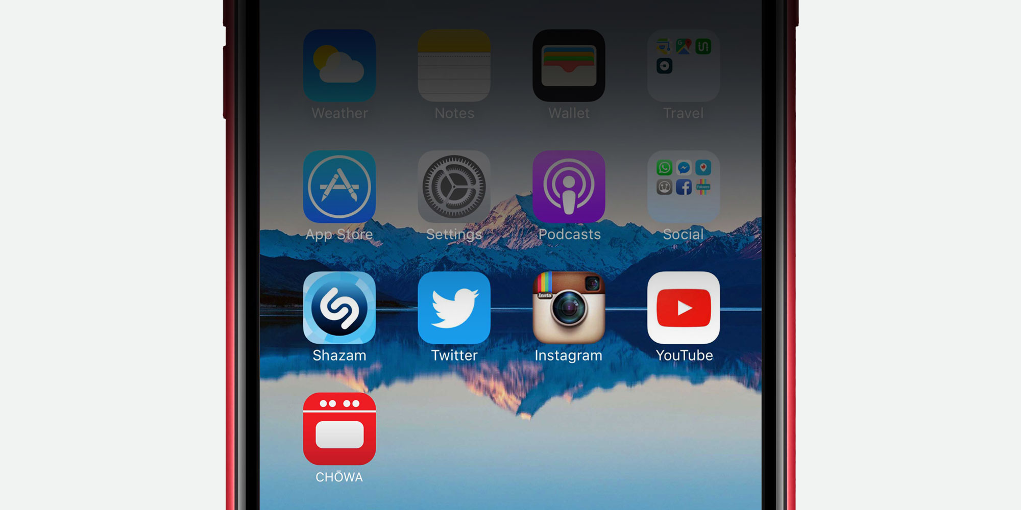

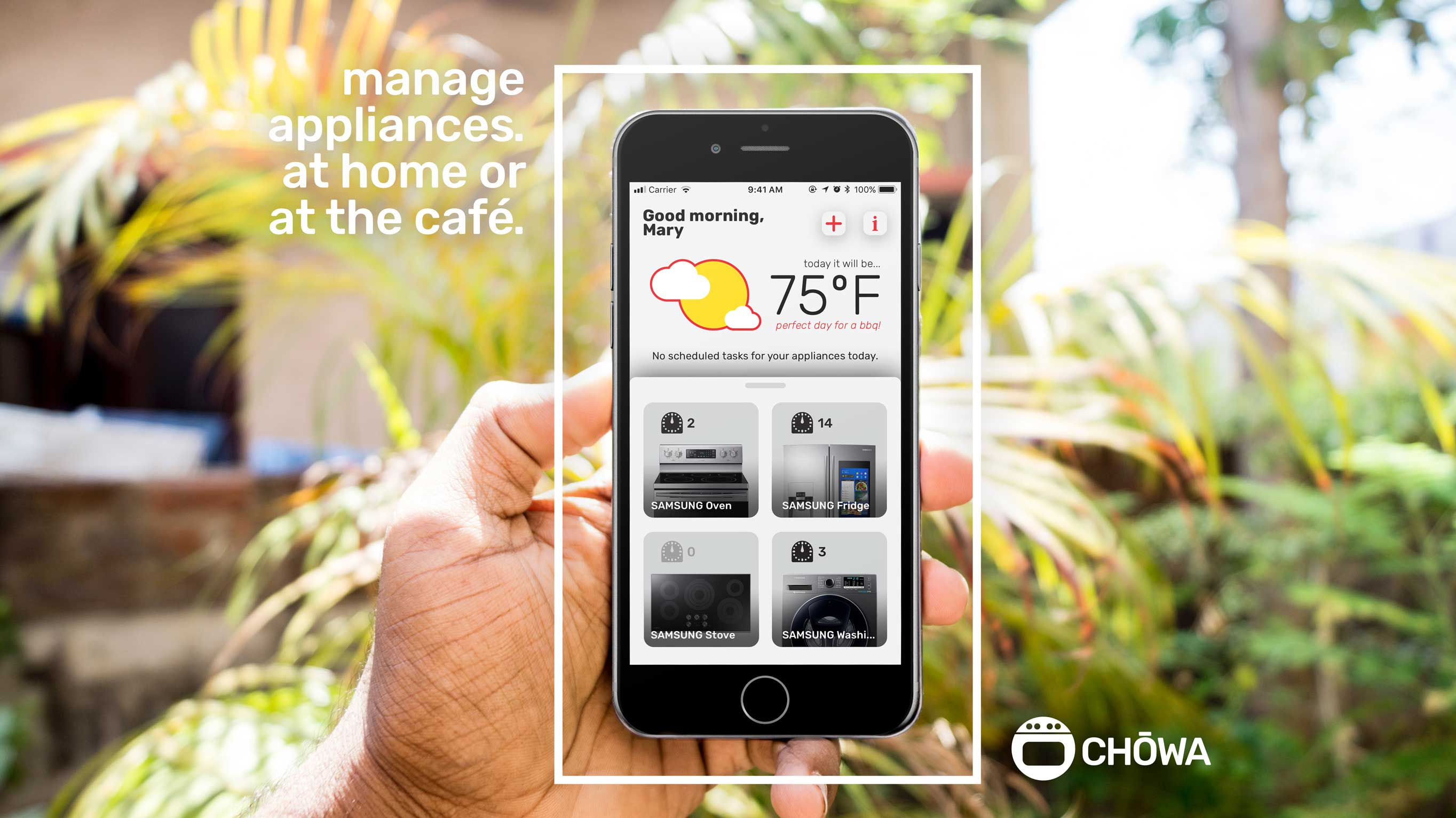


This was a student project focusing on user interface and user experience design, as well as the marketing and brand image aspect of a mobile application. The concept I created was called CHŌWA (調和), which means “harmony” in Japanese. This app allowed the users to maintain harmony in their life by connecting their phone to their smart appliances and controlling and maintaining them remotely. The design features a bold red color accented with off-white and off-black colors, and the app and advertisements contain some cartoon illustrations of your phone and appliance communicating with each other.
Student project
UI/UX design, brand identity, advertisement